Table of Contents

|
gtkmm provides four basic types of buttons:
Note that, due to GTK+'s theming system, the appearance of these widgets will vary. In the case of checkboxes and radio buttons, they may vary considerably. There are two ways to create a Button. You can specify a label string in the Gtk::Button constructor, or set it later with set_label(). To define an accelerator key for keyboard navigation, place an underscore before one of the label's characters and specify true for the optional mnemonic parameter. For instance:
Gtk::Button* pButton = new Gtk::Button("_Something", true);
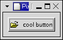
Wherever possible you should use Stock items, to ensure consistency with other applications, and to improve the appearance of your applications by using icons. For instance, Gtk::Button* pButton = new Gtk::Button(Gtk::Stock::OK);This will use standard text, in all languages, with standard keyboard accelerators, with a standard icon. Gtk::Button is also a container so you could put any other widget, such as a Gtk::Image into it. This example creates a button with a picture and a label. File: buttons.h
#ifndef GTKMM_EXAMPLE_BUTTONS_H
#define GTKMM_EXAMPLE_BUTTONS_H

#include <gtkmm/window.h>
#include <gtkmm/button.h>

class Buttons : public Gtk::Window
{
public:
  Buttons();
  virtual ~Buttons();

protected:
  //Signal handlers:
  virtual void on_button_clicked();

  //Child widgets:
  Gtk::Button m_button;
};

#endif //GTKMM_EXAMPLE_BUTTONS_H
File: buttons.cc
#include "buttons.h"
#include <iostream>

Buttons::Buttons()
{
  m_button.add_pixlabel("info.xpm", "cool button");

  set_title("Pixmap'd buttons!");
  set_border_width(10);

  m_button.signal_clicked().connect( SigC::slot(*this, &Buttons::on_button_clicked) );

  add(m_button);

  show_all_children();
}

Buttons::~Buttons()
{
}

void Buttons::on_button_clicked()
{
  std::cout << "The Button was clicked." << std::endl;
}
File: main.cc
#include <gtkmm/main.h>
#include "buttons.h"

int main(int argc, char *argv[])
{
  Gtk::Main kit(argc, argv);

  Buttons buttons;
  Gtk::Main::run(buttons); //Shows the window and returns when it is closed.

  return 0;
}
Note that the XPMLabelBox class can be used to place XPMs and labels into any widget that can be a container. The Gtk::Button widget has the following signals, but most of the time you will just handle the clicked signal:
|